

Princess Polly, an Australian-based online clothing boutique, has become a popular destination for young women seeking the latest trends. Their focus is on providing high-quality, on-trend pieces at accessible prices. Usability is a top priority for Princess Polly and aim to ensure a smooth shopping experience. Additionally, the company has recently embarked on a journey towards more sustainable practices. Their website highlights their commitment to incorporating ethical sourcing into their supply chain, aiming to maintain both affordability and quality in their garments.

Screenshot of the Princess Polly home page, taken 1/28/24.
Current Website Overview
The website uses a bold, maximalist design with contrasting colors and large images – makes sense for showcasing their trendy clothes. While it reflects their brand well, the crowded layout and lack of intuitive navigation make browsing a bit clunky. To help Princess Polly revamp their website in future iterations, we conducted a series of in-person and online user experience tests with a large group of participants. We evaluated everything from the menus and content to the design and navigation. This report dives into the findings, including data analysis and recommendations. While the current site works okay, there’s room to make the shopping experience even smoother.
Research and Data Collection
Competitor Analysis
Let’ s start by checking out the competition. By comparing Princess Polly to similar online retail sites like Hello Molly, PrettyLittleThing, and ASOS, we can see what features work well and where there’s room for improvement.

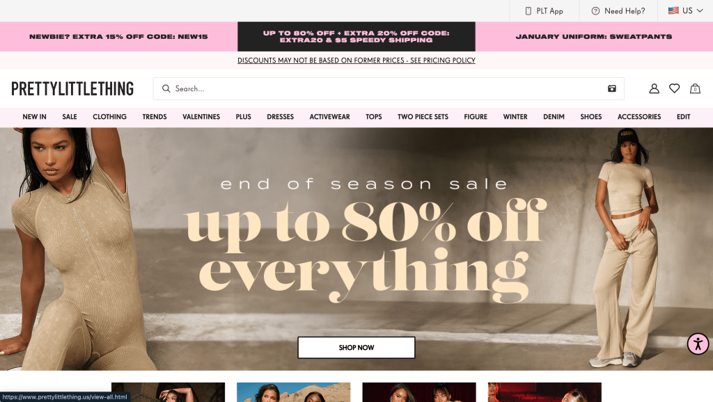
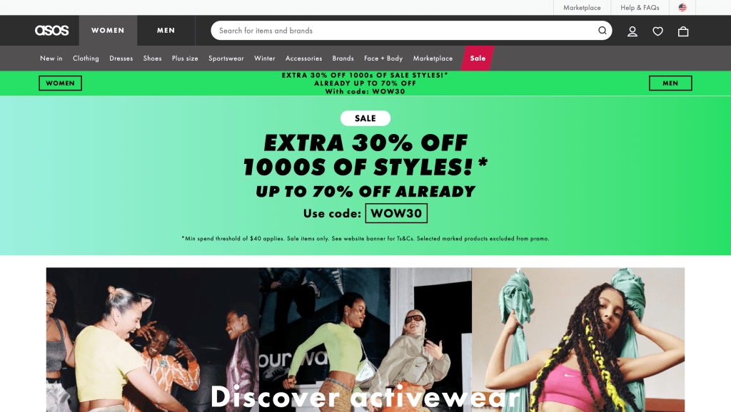
Screenshots of the Hello Molly, PrettyLittleThing, and ASOS home pages (left to right), taken 1/28/24.
Princess Polly rocks a trendy website, just like their competitors, with bold visuals and not a lot of white space. While this follows industry standards, it can be slow to load and overwhelming to navigate. Users might appreciate a simpler layout, even if it means sacrificing some aesthetics.
Search functionality is a key difference. Unlike competitors, Princess Polly auto-populates results before a search is even complete, which can be distracting. Additionally, returning to filtered searches requires extra clicks. A cleaner design with more breathing room, removing auto-filled results, and improved navigation would go a long way in improving user experience.
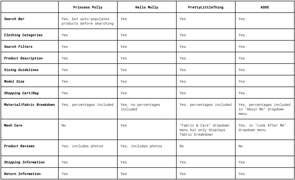
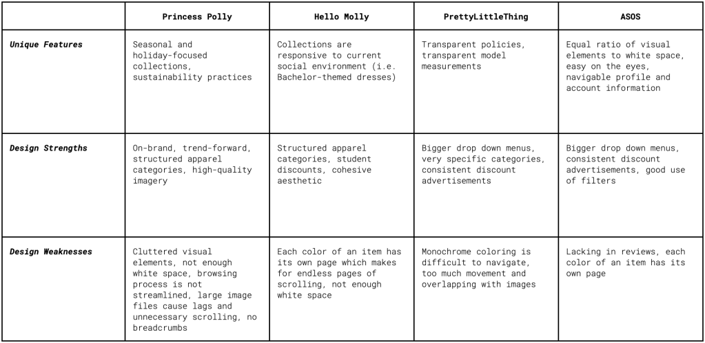
The table on the left assesses website features, while the table on the right assesses functionality. Click to view the full results of the Competitor Analysis.
Personas
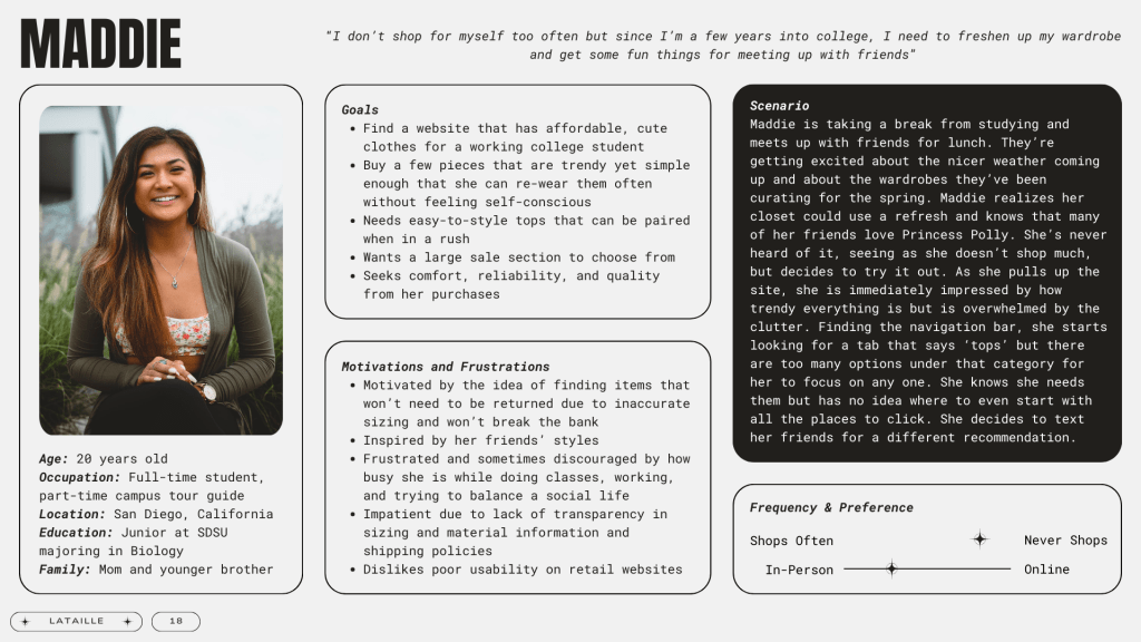
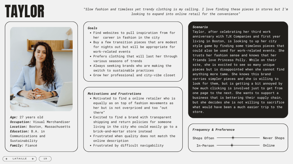
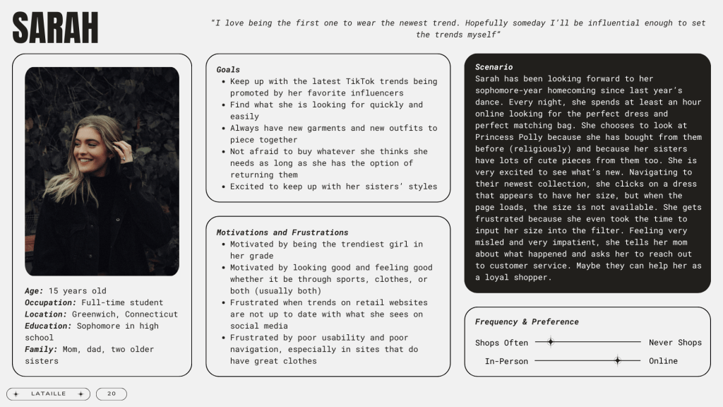
To gain a deeper understanding of Princess Polly’s core user base, we’ve developed detailed customer personas.
Click to enlarge each Persona and Scenario.
These three personas represent realistic archetypes of their target audience and are based on practical shopping scenarios. By utilizing these personas, we can cultivate empathy for user experience, enhance our recall of their needs, and ultimately prioritize features and guide design choices that cater to their preferences.
Interview Proposal
Interviews are one of the most widely used methods for conducting user research. They provide comprehensive insight into who your users are, their backgrounds, experiences, and frustrations. In this case, the data collected from this interview study will help identify solutions to make users’ lives easier while using the Princess Polly website.
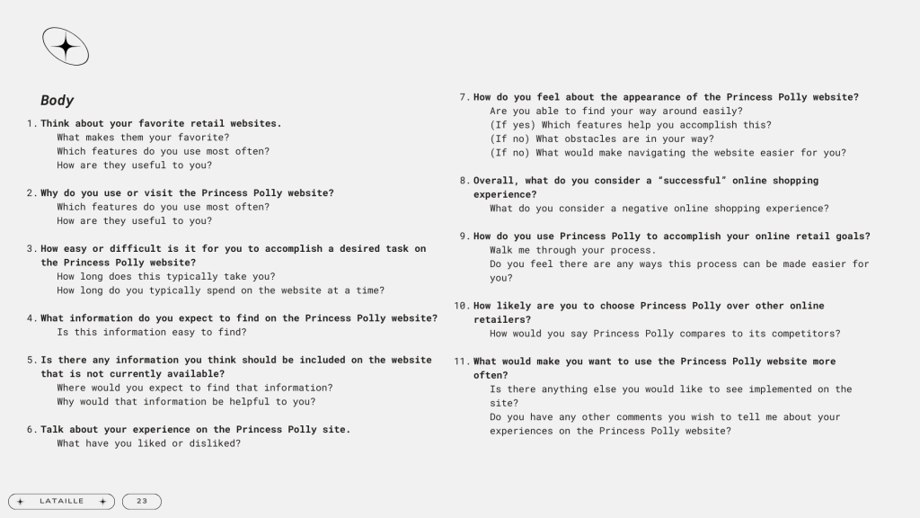
Hypothetical questions for what a user interview could potentially look like. These questions were not carried out among participants.
For Princess Polly to better understand its users and to keep the content focused, the questions asked will seek to explore the following research questions:
- For which purposes do users visit the Princess Polly website?
- Which features of the Princess Polly website do users find most useful?
- What would make an online shopping experience on the Princess Polly website a first choice for users over other online retailers?
Survey Proposal
Surveys are a powerful tool to quickly gather insights from a large audience. They reach way more people than most other methods and are perfect for filling in the gaps left by other studies. We use a mix of multiple choice and open-ended questions to understand what users really need, and this feedback helps us refine the platform and fix any problems people might be having.
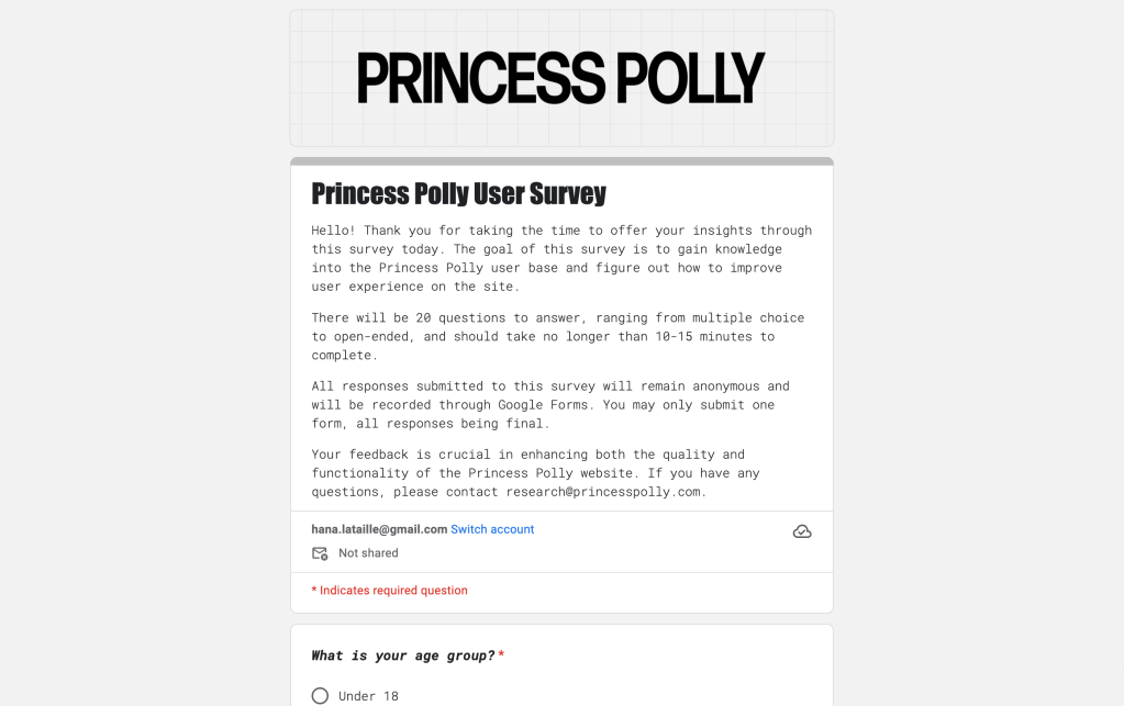
Screenshot of the potential user survey, created using Google Forms.
This quick survey helps us understand what users love (and maybe don’t-so-love) about shopping on Princess Polly’s website. Answers will help enhance profiles and make usability much smoother. The full survey can be explored here.
Card Sort
Card sorting helps us see how users organize information. In this study, participants group labeled cards based on their logic, revealing how their mental models of certain products, or in this case, the Princess Polly website. This quick method provides valuable insights for building a user-friendly website structure.
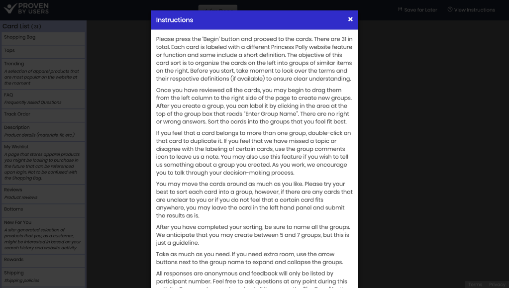
Card sorting activity on the Proven By Users website. Participants first read the instructions (left) before dragging and sorting the cards into their respective categories (right).
Three Princess Polly users participated in this open card sorting test. 31 cards were presented during in-person individual sessions through the Proven By Users online software system. The cards were developed using existing website page titles, links, and actions that users might take upon visiting the site. Sessions were recorded to capture nuanced data of each participant’s mannerisms and behaviors during the sorting process.
General observations included:
- Participants 1 and 3 made seven groups, while Participant 2 made six groups.
- Participants categorized cards similarly but named certain categories differently.
- Participants disagreed on the groupings of 14 cards.
- No participants duplicated, renamed, added, or declined to use any cards.
The similarity matrix below was created using the results of each card sorting activity.
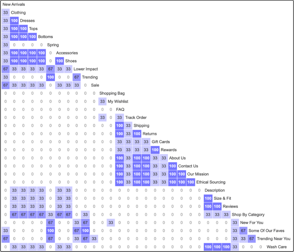
Participants easily categorized apparel items like “Tops” and “Dresses,” but struggled with unique categories like “Spring” and “Trending.” This suggests the main navigation and landing page layout might be confusing. A separate “Site Recommendations” menu could improve clarity.
Opinions differed on product details like descriptions and reviews. Two users preferred them on product pages, while one wanted them readily available on the landing page.
One interesting insight was the desire for a centralized location for order information (Shopping Bag, Track Orders, Shipping & Returns). This “one-stop shop” could significantly improve the online shopping experience.
Diary Study Proposal
Diary studies are a great method for gathering accurate user data over a long period of time. Participants record their thoughts and experiences in their own words, allowing researchers to analyze both feelings and behaviors without needing to be there.
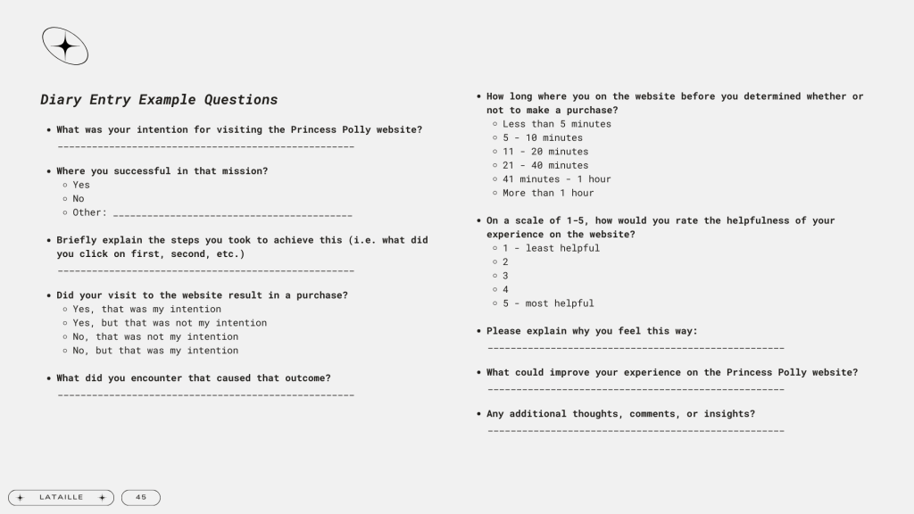
Hypothetical questions for what a diary study could potentially look like. These questions were not carried out among participants.
Like other research methods, diary studies help us answer key questions and achieve specific goals. As an online retail website, Princess Polly has business requirements that revolve mainly around browsing versus purchasing. But happy users buy more! Therefore, this study aims to determine how the current interface of the Princess Polly website can be improved to increase conversions, but more importantly how it can enhance the overall user experience.
Heuristic Evaluation
We examined Princess Polly’s website using ten well-established principles of usability in a heuristic evaluation. These principles are based on how people naturally think and navigate websites. By going through specific tasks and identifying areas where the website breaks these rules, we can pinpoint exactly where improvements are most needed.
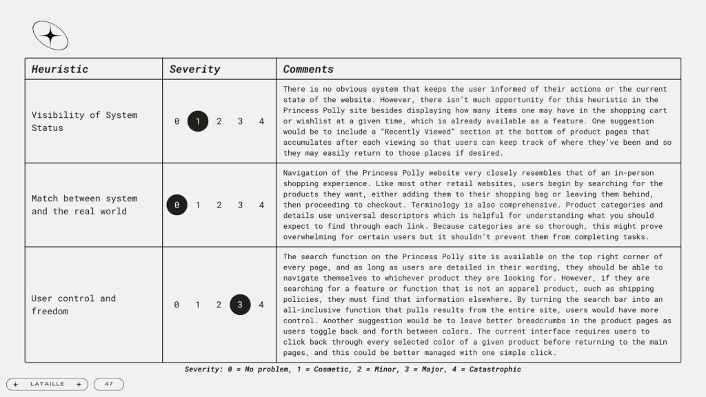
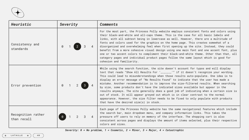
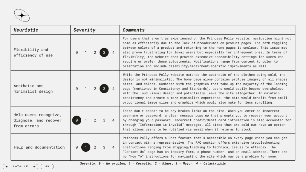
Click to enlarge each set of heuristics.
Results of the evaluation can be seen above. Heuristics that caused the most concern were:
- User control and freedom
- Error Prevention
- Flexibility and Efficiency of Use
- Aesthetic and Minimalist Design
Again, we encounter the problem of poor breadcrumb history when toggling between pages. Size filters sometimes show out-of-stock products, which is frustrating. The overall design is cluttered and could use an update. Simplifying the layout, fixing the navigation, and correcting filter discrepancies would make for a more seamless shopping process.
Usability Testing
Usability testing in UX research is the observation of participants attempting to complete a task, or set of tasks, with a product based on predetermined scenarios. In this case, product performance of the Princess Polly website is evaluated against metrics such as time spent on the task, task success, and comments made during the sessions. By figuring out how easy or difficult it is for users to make sense of the website, researchers can identify usability issues to be addressed in future iterations.
The testing sessions were conducted through Apple’s QuickTime Player feature and utilized three participants. We developed a script composed of an introduction, instructions, warm-up, five tasks, and a wrap-up. These five tasks included:
- You have a formal event coming up and are looking for a quality floor-length evening gown to wear. Pick a dress and find out its material composition and care instructions. Then determine which size would be best for you.
- You support sustainable fashion and are constantly looking for brands that participate in these efforts. Determine if Princess Polly has any sustainability practices and figure out how they source their materials.
- You find a lot of your fashion inspiration from influencers on Instagram. Figure out how you can find specific Princess Polly outfits worn and posted by your favorite influencers, and navigate to those products.
- You prefer to use Afterpay as your primary method of payment on most retail sites because the installments make more sense for your financial situation. You purchased a top two weeks ago and wish to return it. Figure out how you will be refunded.
- As a loyal Princess Polly customer, you’re very interested in the exclusive collections they offer, especially those practiced with sustainability in mind. Find a silver bracelet that was ethically sourced and add it to your shopping cart.
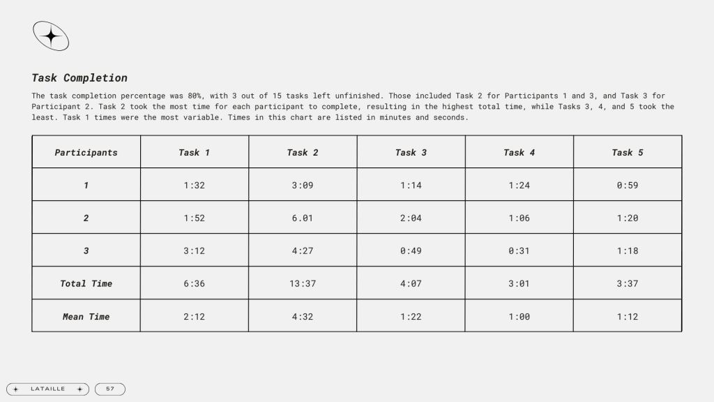
Click to enlarge the table.
Participants were able to finish tasks with an 80% completion rate. Consensus of the study determined that website resources are relevant and valuable, however, the disorganization and information inconsistencies need to be revised to better serve its users. Website terminology should also be updated to account for users who are not as comfortable with the brand or the online shopping process itself. Incomplete filtered search options create confusion for those looking for specific products, and this must also be corrected for a more seamless shopping experience. With a more standardized, understandable, and detailed design, usability will be greatly improved on the Princess Polly website.
Recommendations
Based on the analyses outlined in this report, we’ve made recommendations to improve the overall usability of the Princess Polly website. Key changes involve a simpler home page design, less distracting search functions, detailed search filters, easier navigation among clothing categories versus collections/trends, organization of information on resource pages, and adopting universal terminology.
The next iterations of website improvement should address the following (yes, the list is long, but it will make a huge difference):
- Smaller imagery and visual elements across the entire website.
- Consistent fonts and colors used in home page graphics.
- More white space.
- No auto-populated search results prior to making inputs in the search bar.
- Improved breadcrumbs between product pages and product colors.
- Distinction between main clothing categories and site-recommended categories (i.e., collections, trends, etc.).
- Separate product detail tabs for both Materials and Wash Care.
- Addition of customer reviews on product pages.
- Addition of an all-inclusive order function that features the shopping cart, shipping and return information, order history, and the ability to track orders.
- Addition of a “Recently Viewed” section that auto-populates on the bottom of product pages that accumulates after each viewing.
- All-inclusive search function that pulls information from the entire website, not just products.
- Accurate size filter that omits products with the indicated sizes out of stock.
- Addition of a search filter that includes Maxi dresses as a style option.
- Organization of sustainability resources into logical sections and subsections.
- Utilization of graphs, bulleted lists, and other visual elements to help simplify sustainability information.
- Easily accessible ethical audit results, sustainability standards, policies, and data.
- Easily accessible Material Guide on the Ethical Sourcing page.
- Replacement of “Edits” to “Shop By” / “Collection” whether it be seasonal, by influencer, or trend.
- Consistency of Afterpay information across all pages where it’s available.
- Replacement of the jewelry Color filter to a Metal filter with options including all metals offered on the site.
- Replacement of the “Lower Impact” title to something more widely understood.
That was a lot, but here’s why this is important
These recommendations aim to not only address existing issues but also to create a more intuitive and user-friendly platform for visitors. As the digital landscape evolves and user expectations rise, prioritizing usability through these adjustments will undoubtedly contribute to the sustained success and positive perception of the Princess Polly brand.
If you wish to view the full report, please click below.
Thank you for reading!

Leave a comment