
We all have a mental registry of logos that we immediately recognize when we see them. Prime examples of these include the Nike swoosh, McDonald’s arches, and Apple’s… apple.
I’ve never been able to fully understand what makes them so iconic, but this week I delved deeper into brand makeup and have begun uncovering how these clever designs wield such significant power.
Makeup, but for your brand
In her book, Graphic Design for Everyone (2019), Cath Caldwell impresses the importance of memorability. She says “the graphic visual language you use tells the story of your brand in its meaning, structure, and visual form” (p. 35).
Take the Nike swoosh, for example.
via: https://en.wikipedia.org/wiki/Swoosh
Let’s be real, you had the word “Nike” in your head well before reading it.
But that’s the point.
Designed by Carolyn Davidson, the swoosh is one of the most easily recognizable logos in the world. She pulled her inspiration from the real Nike, the Greek goddess of victory, and the swoosh itself is meant to imitate her wings (Paish).
Additionally, the checkmark symbolizes action and the desire to “Just Do It.” Its fluid silhouette suggests motion and speed, making this minimalist design a great example of instilling brand values into a small logo.
Keeping your options open
Caldwell also notes that “thinking about how your brand could cope with expansion might save you a lot of time and money in the future” (page 38). As important as it is to start off strong with your initial branding and logo efforts, it’s equally as important to think about future iterations or adaptations of your brand.
You may be wondering why you’d ever want to stray from the solid brand plan you’ve worked so hard to build for your product. It’s okay. A flexible brand doesn’t mean an inconsistent one. You can still stay true to the brand personality while creating stretch. As long as you maintain the verbal and visual design, branching out into new areas won’t strip away your brand’s identity when it’s time to connect with a wider audience.
This is why you see many successful companies go through different phases of their logos. While you can strategically outline each aspect of the brand when first taking on these efforts, there’s no sure way to predict how it’ll exist in the market. As companies navigate the field, they’ll often undergo design developments to reflect the state of their growth.
A good example of this is outlined in this article about Apple’s logo evolution.
via: https://thinkmarketingmagazine.com/apple-logo-evolution-story/
What I’m working on
To put my learning into practice, I created a brand plan for a local coffee shop in my hometown, called Daybreak Coffee Roasters. At reasonable prices, they offer some of the highest grade coffee in town (if not, the highest). This kind of product, in my opinion, deserves an elevated visual brand to match it’s quality. Through this project, I hope to offer Daybreak a solid strategy for growing their business and influence as a leading local coffee roaster.
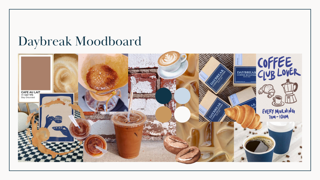
After conducting some preliminary research on the company, its competitors, and its audience, I used their current visual brand to start compiling imagery for a mood board. Daybreak has a good foundation when it comes to their verbal and visual brand. They appear to use a simple color palette consisting of earthy, neutral tones. This pattern comes through clearly on both their Instagram and website. However, it could be made to look a bit more consistent across their overall brand makeup.
Using Canva as my design medium, here’s what I came up with:
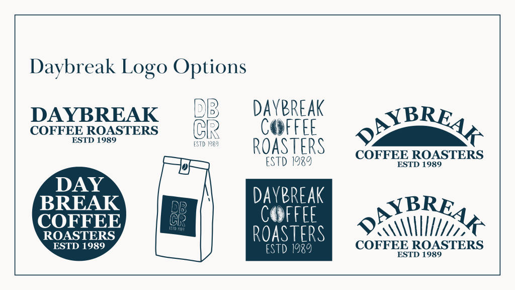
Next, I came up with a simple color and typeface kit to create a few logo options. The designs are very preliminary. Canva doesn’t have as much flexibility to its functionality as other software systems do, but I’m looking forward to exploring those more in the upcoming weeks.
For now, I’m really liking the idea of minimalism. The cafe itself is very simple and provides a peaceful atmosphere for its patrons. Also, the simpler the logo design, the more room there is for creativity in how it’s used. This should be especially beneficial for brand expansion.
The only non-typeface elements that I experimented with were coffee beans and sunrise-type designs. This may seem basic, but again, the less complicated the design, the more fun you can have with it when it comes to marketing materials, social media, etc.
This is the result:
Rounding out the brand plan, I provided the company with a few expansion suggestions that would potentially connect them with a wider audience while maintaining brand consistency.
To read those and to view the entire brand plan, feel free to click the link below.
If you have any suggestions or further insights on this topic, please let me know in the comments!
Works Cited
“Apple Logo Evolution Story.” Think Marketing, 22 June 2012, thinkmarketingmagazine.com/apple-logo-evolution-story/. Accessed 25 Mar. 2024.
Caldwell, Cath. Graphic Design for Everyone. London ; New York, Dorling Kindersley Limited, 2019.
Paish, Chris. “The World’s Most Famous Logos and What You Can Learn from Them | VistaPrint US.” Vistaprint Ideas and Advice US, 2018, http://www.vistaprint.com/hub/worlds-most-famous-logos. Accessed 25 Mar. 2024.

Leave a comment