Since having this explained to me back in high school, I’ve always been mindful of the method I choose to present my writing in. “The medium is the message” is what we’ve been told, meaning that how we communicate is just as important as what we’re saying, if not more.
I know this theory from Marshall McLuhan has been widely disputed, but it does make sense. You can’t expect someone to understand you if the delivery doesn’t match the message.
What I’ve come to appreciate over this past week is that the same principle holds true for the visual makeup of words themselves, that being typeface.
The F-word, but it’s not what you’re thinking
First, we have to clarify one thing:
You’re not using the word “font” correctly. Don’t worry, I wasn’t either until six days ago. What we typically refer to as a “font” is actually called a “typeface.”
Typeface describes a family of characters, while font describes the set of characters within the typeface that share a style.
For example, Helvetica is a typeface, whereas Helvetica Light and Helvetica Bold are fonts.

The Helvetica typeface (left) versus the Helvetica font family (right).
The role of typeface in conveying messages
As Cath Caldwell states in her book, Graphic Design for Everyone, the function of typography in design extends far beyond mere legibility. Each typeface possesses its own unique personality, projecting distinct characteristics. Therefore, it’s crucial to select fonts thoughtfully, as they set the tone and greatly influence the overall impact of your design project (p. 51).
A practical question to ask yourself when deciding on a typeface is “what job do I need this text to do?” From there, you might want to consider where it’ll be seen, who will see it, or if you need to use numbers or special characters.
What I’m working on
To put this idea into practice, I experimented with a few mood/type demos in which the typeface is meant to represent the respective wording.
My favorite typefaces from this project are part of the California demo. All three are combinations of scrip and display fonts and aim to capture the laid-back and friendly vibe of the West Coast. My hope is that someone encountering that message on, let’s say, a travel brochure would feel inspired to visit.
Another demo that I really enjoy is Boutique. Here, the serifs are meant to be attention-grabbing while the cursive conveys elegance. If a potential customer were to see these typefaces on a store’s social media page, they should feel as though it’s a reputable brand that they’d like to check out.
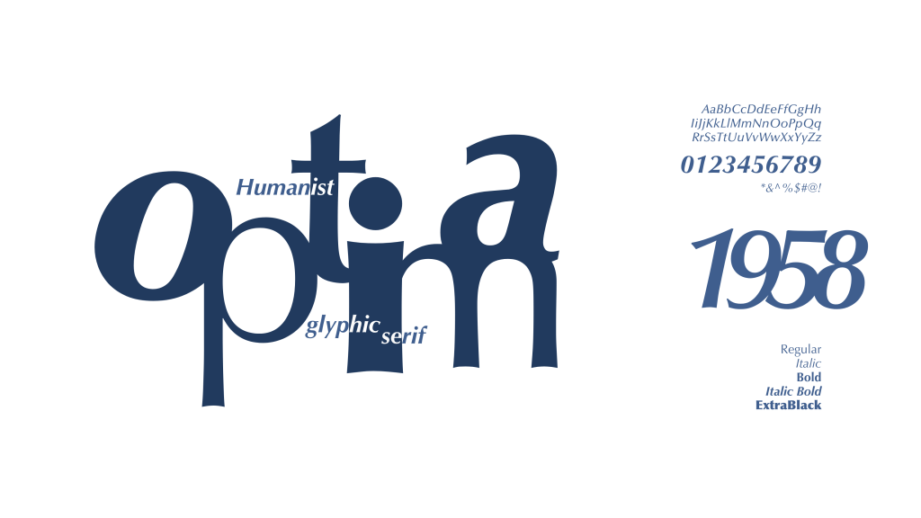
Next, I created a type specimen poster to help me dig deeper into the true functions of typography. I selected Optima and used only the typeface, colors, and shapes to design it. This way, I became more familiar with the intricacies of the type itself.
Typography.com has countless amazing examples of these if you’re interested.
Brand plan still brewing
To wrap up this week’s exploration, I added some additional ready-for-launch products to my Daybreak Brand Plan. Every well-known company has a strong brand identity system that keeps their business booming, and this is only done with strategic typography and logo design!
If you missed the first part of my project last week, feel free to check out my blog post where I talk about my research, designs, and general thought processes of the brand plan.
To wrap it up, I’ll re-emphasize the importance of understanding the nuances of typeface selection. The choices made in the design process set clear tones for how your message is received. So, whether it’s through the careful consideration of serif versus sans serif or the use of bold versus italic fonts, remember that every decision carries its own narrative – a narrative that speaks as loudly as the words themselves.
Works Cited
Caldwell, Cath. Graphic Design for Everyone. London ; New York, Dorling Kindersley Limited, 2019.
“Fonts by Hoefler&Co.” Typography.com, H&Co, 2019, http://www.typography.com/. Accessed 1 Apr. 2024.

Leave a comment