
Have you ever looked at something that’s made your brain hurt? Maybe it was this dreaded sheet from elementary school:

At that age, I was convinced that this was the hardest quiz one could take in their life. It added up (pun intended) – so many problems and such little space.
That’s exactly the point, though. The reason you would take one look at this paper and fill with anxiety is because of its layout. Sure, the columns and rows are perfectly aligned in a 10×10 grid, but that means there are exactly 100 modules in this structure, and that’s about 99 too many (kidding, one singular module would be a bit boring).
Where layout comes into play
Designing for the eye is the art of structuring visual elements in an orderly, pleasing, and comprehensible manner. Sometimes you can get away with two of these guidelines, but just one isn’t enough to be considered a successful design.
This is the case with the math worksheet; the individual problems are in order, but the sheer amount of them creates confusion. One day, someone will change the entire fifth grade curriculum with this logic. For now, we can educate ourselves on how to avoid these mistakes and improve our understanding of good design principles.
The basics
There are many ways to build a good design, but the goal is always the same: to convey the message as meaningfully and attractively as possible (Caldwell). To get started, you should familiarize yourself with some basic steps.
- Choosing a format, which is the size, shape, and medium in which the design will be produced.
- Being okay with white space and figuring out how to use it to your advantage.
- Structuring the layout, or the arrangement of your design which may include strategies such as the Golden Ratio, Rule of Thirds, or modular structures.
- Sketching your ideas before diving straight into your work to come up with more creative ways to achieve your aims.

Many popular logos such as Twitter, Apple, and Pepsi follow the proportions and shapes of the Golden Ratio (via InVision)
Hierarchy
The role of a visual designer is to take information and organize it in a way that’s easy to understand (Caldwell). Using hierarchy to emphasize key elements, they guide the audience through an engaging and aesthetically pleasing journey into the message. Various techniques can be used to achieve this order:
- Typography, with experimentation of size, uppercase lettering, weight, position, color, and contrast to rank information.
- Color, by use of color blocks, repetition, contrast, and color coding to guide the eye through more complex layouts.
- Scale, or the size of elements in relation to others around it.
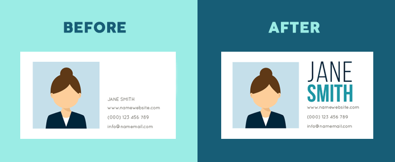
Left: Visual hierarchy is not present; no information stands out as most important. Right: Successfully employs visual hierarchy with use of typographic size, uppercase lettering, weight, and color (via Visme)
Keeping a mindful eye on my own designs
Attempting to put these design standards into play, I created a promotional package for a famous music event, the Newport Folk Fest. The materials include a poster, flyer, Facebook banner, three Instagram posts, tickets, and a t-shirt.
My goal was to not only maintain a solid brand kit throughout each piece, but to also employ basic layout and hierarchy guidelines which support the main purpose of enticing people to attend this iconic event. You can browse the materials below.
First up is a simple poster design. I liked the idea of incorporating vintage-y musical elements and decided on a guitar and vinyl theme. This piece set the tone for the colors, type, and overall vibe of the event package.
Next is the flyer. It uses the same elements from the poster with the addition of more relevant details about the event. This piece contains a lot of information, so I did my best using color, type, and size to make key elements apparent.
This simple Facebook banner uses lots of white space, with only the most important details such as date, venue, and ticket information on display for clarity.
These are the three promotional Instagram posts. While technically on the more complex side, color plays a vital role here in leading the reader’s attention through the messages. The first slide is the announcement of a new Saturday artist, the second is the entire weekend lineup, and the third is the release of event-exclusive merchandise.
To facilitate such a memorable weekend, I designed two versions of admission tickets that festival goers would use to enter the venue. They’re meant to be aesthetic keepsakes for their owners but double as signals to security and staff of the ticket holder’s access level (GA or VIP). It’s essentially two messages in one, made clear with different color schemes.
Last is the t-shirt. Like the take-home tickets, the elements here serve the purpose of leaving the attendee with a fond memory of their time at the festival. The front is classic with a small pocket area design that communicates the name of the event, while the back showcases the artist lineup in an organized yet stylish manner.
What I mean to say by all this
Basically, the whole point of this blog post was to prove that elementary math worksheets aren’t just bad, but graphically bad… which also goes to show that I wasn’t misunderstanding the math, but rather the layout (I’m going to keep telling myself this).
In the world of design, where every element vies for attention, the importance of layout cannot be overstated. The way information is structured directly impacts comprehension, engagement, and enjoyment. By embracing the basic principles of layout and hierarchy, designers can craft experiences that not only inform but captivate. Whether it’s a simple addition table or an intricate promotion package, the art lies in arranging elements in a manner that speaks for itself.
Works Cited
Caldwell, Cath. Graphic Design for Everyone. London ; New York, Dorling Kindersley Limited, 2019.

Leave a comment