

Starting a project without a clear plan for how it will come together can quickly go south. Tasks pile up, deadlines slip, and the final product looks nothing like you envisioned.
When it comes to content design, this chaos can be avoided by using the right tools from the start. Instead of disjointed page toggling, confusing navigation, and key content buried under clutter, let’s look at four key processes that will keep your workflow efficient: Prioritization Tables, Content Models, Sitemaps, and Wireframes.
For Context…
HealthReach, a medical and healthcare service for families in rural Maine, has been the focus of my content strategy report for the past couple of weeks. This report will ultimately inform a response to a request for proposal (RFP) that aims to guide a user-friendly website redesign.
The primary goals of the HealthReach website redesign, as outlined in their RFP, include:
- Improving patient services and user engagement through enhanced functionality, clear navigation, and an intuitive interface
- Boosting visibility and search engine optimization (SEO)
- Strengthening connections with community partners and improving patient access for healthier outcomes
Currently, the HealthReach website is outdated in its structure, functionality, and presentation of content. My previous work included a thorough content audit and competitive analysis, which involved extensive SEO research. Having established content priorities, the next phase of my project focuses on organizing and presenting this information in a clear and user-friendly manner.
To achieve this, the content design phase of the project will optimize layout, accessibility, and navigation, ensuring that users can easily find the information they need while staying aligned with HealthReach’s mission.
In short, this redesign is about better serving HealthReach’s patients and partners by adopting modern web standards and enhancing the user experience. Now, let’s take a closer look at the first essential tool in content design: the prioritization table.
Prioritization Tables: Laying the Foundation
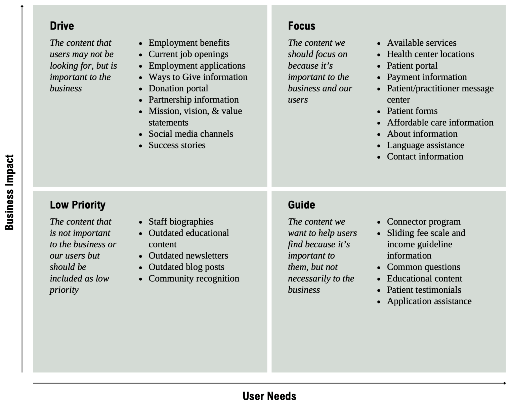
Meghan Casey, author of The Content Strategy Toolkit, describes prioritization as a way to “determine what content you need to meet your audiences’ expectations and how you can achieve your organizational goals” (p. 177). A prioritization table guides the development of website content by evaluating the significance of various sections for both users and the business.
In this initial stage of content design, you should ask yourself questions such as:
- What content is important to both your business and your users?
- What content is important to your users but not so much to your business?
- What content do you need your users to look at because it’s important to your business?
- Do you have content that’s not beneficial to anyone but feel like you need it anyways? (You do)
This table analyzes key HealthReach content areas and ranks them based on their importance and relevance to both audiences.
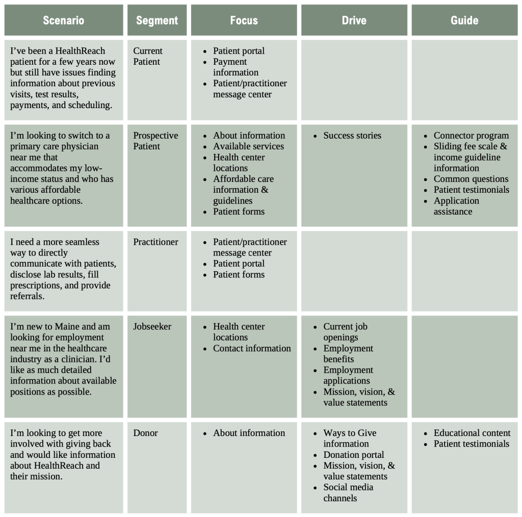
This is an alternative format that combines the topic lists with user scenarios using five different audience segments: current patients, prospective patients, practitioners, jobseekers, and donors.
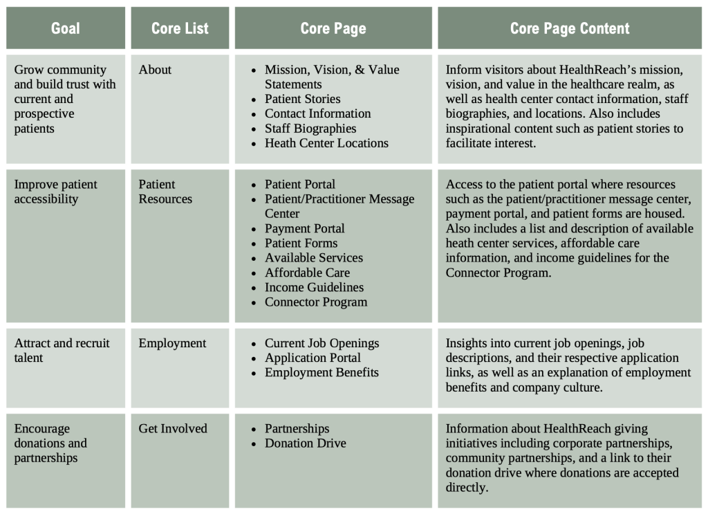
Content Models: Building the Backbone
Like the prioritization table, the content model organizes related information, making it easier to structure and deliver content on the website. It’s a tool that ensures the content aligns with both HealthReach’s goals and the needs of its users, which helps guide visitors to the information they need.
This content model outlines the types of content HealthReach should provide, how those pieces connect, and how they should be laid out across the site.
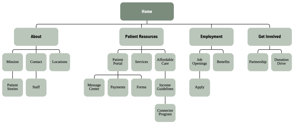
Sitemap: Visualizing the Structure
A sitemap offers a clear visual of a website’s structure, making it easier for users to find what they need. Casey explains that “organization of content refers to the framework for grouping, labeling, and relating content to make it discoverable by people (meaning the people the content is for and the people who produce the content) and machines (such as search engines and your content management system (CMS)” (p. 191).
This sitemap is a refined version of HealthReach’s existing layout that enhances usability. It includes four main lists: About, Patient Resources, Employment, and Get Involved.
Wireframes: Bringing the Design to Life
The wireframe serves as the finishing touch in content design. It shows how different elements – text, images, videos, and buttons – are arranged on the webpage to create the overall structure. It also helps stakeholders see what works before diving into development.
Below is my proposed wireframe for the HealthReach website homepage.
In Sum, Plan Ahead
Effective content design requires a clear plan and the right approach from the jump. By focusing on organization and user experience, you can create a website that not only aligns with business goals, but also saves valuable time and effort in the long run. If you’re interested in seeing how this was applied to HealthReach, feel free to check out my full content design report.

Leave a comment