Let’s talk about the unsung hero of design. It’s not what you’re thinking, and it’s not glamorous, but it truly is the backbone of every great design: grids.
Stay with me here – imagine grids as the backstage crew of a Broadway show. They might not be in the spotlight, but without them, the performance would be chaos. In the world of design, grids hold the production together by providing structure and rhythm to our creativity.
Special shoutout to these iconic grid designs (New York Times, if you’re reading this, may I please have a free Games subscription):
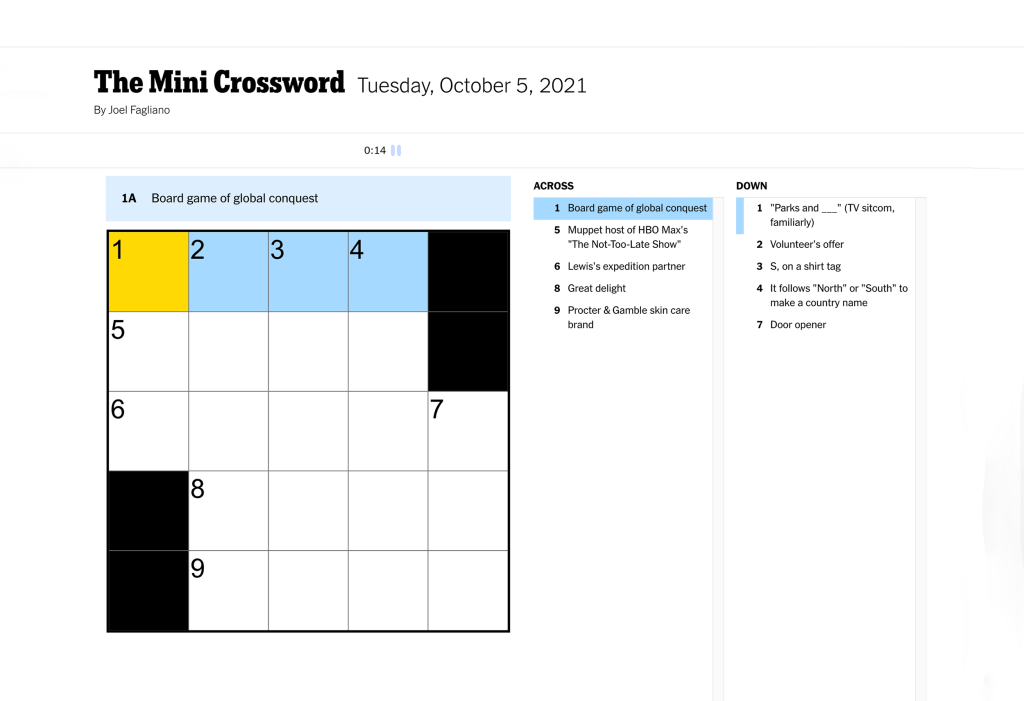
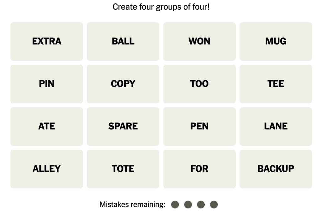
via New York Times
Now, those are two very literal grids. Designs that use this system don’t usually look like this. In fact, most of your favorite websites, apps, newsletters, and other digital content rely on grids to keep their material simple yet engaging to use. This article from the Nielsen Norman Group highlights a few of these.
Grid composition is meant to make your life easier, so if you want to succeed, all you need to do is begin.
Choose and use your grid
There are several types of grids you can opt for when tackling a design: a single column, two-column, or modular grid, to name a few. The choice you make will depend on factors such as the amount of content you have, the pages you need, and whether it’s a print or online project (Caldwell).
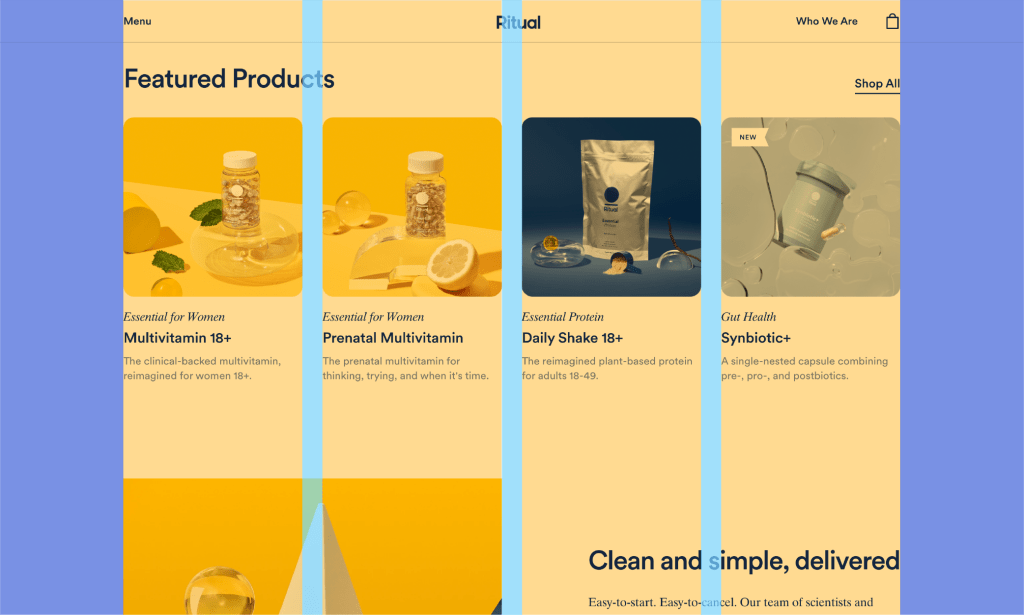
Ritual, the multivitamin brand, uses a four-column grid layout to frame their website (via Nielsen Norman Group)
Start experimenting with your elements
Now that your grid is set up, it’s time to add your material. Remember that the purpose of the grid is to allow you to arrange your elements in a logical way. By establishing flow and balance, the audience is conveniently able to find and comprehend the information. Keep in mind the following composition guidelines as you work:
- Alignment, which employs visual order to make sense of content (i.e., left alignment, right alignment, center alignment, justified). This most often involves text but can also apply to other elements.
- Grouping, where designers make clear visual links between related items to convey meaning. Enclosed elements, space, and similarity are important here.
- Harmony and balance, or the distribution of elements to achieve balance across your design space. Symmetrical balance, asymmetrical balance, size balance, and color balance are a few factors you should consider.
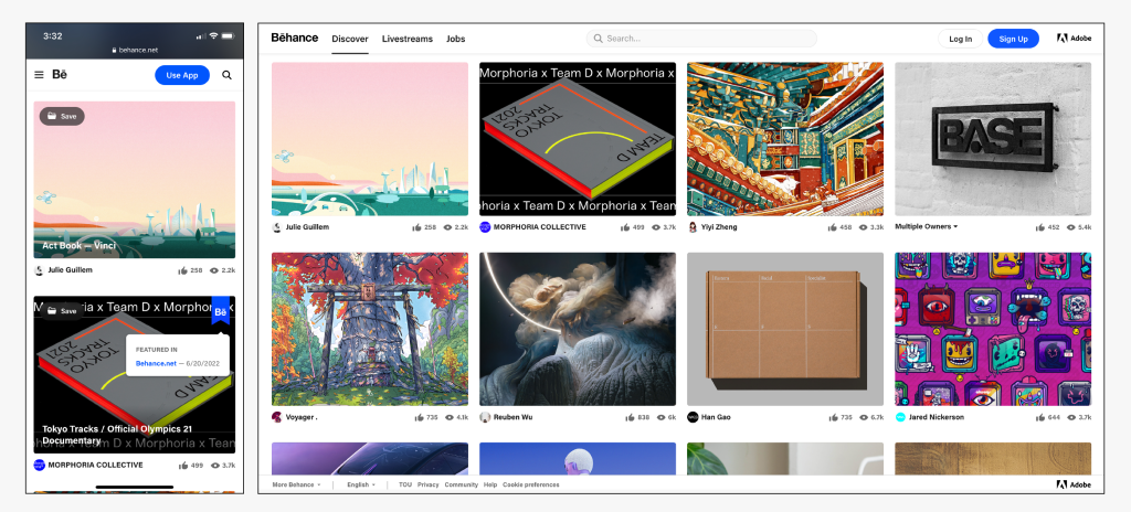
Behance, the creators platform, uses symmetrical balance on their website, giving both sides of the design equal weight (via Nielsen Normal Group)
Composing my own designs
To put my newfound appreciation for grids to the test, I created wireframes and design comps for a company newsletter and website. A wireframe is a simple plan of your design. It helps you figure out how it’ll function by displaying the content organization and by revealing connections between elements (Caldwell).
First is the newsletter, inspired by a local boutique in my hometown. I made the wireframe using Balsamiq, and moved to Illustrator for the design. I used a 4-column grid layout to keep it symmetrically balanced and grouped based on the type of material (event promotion, new arrivals, contact info).
Here is the website, again, based on the boutique. I’ve attempted to create a simpler and more unified landing page for the current website, owing to the new 12-column grid layout.
You should use grids too!
These mere vertical and horizontal lines aren’t about keeping things tidy (although they do a stellar job at that), they give us the freedom to experiment while ensuring that every element finds its perfect place.
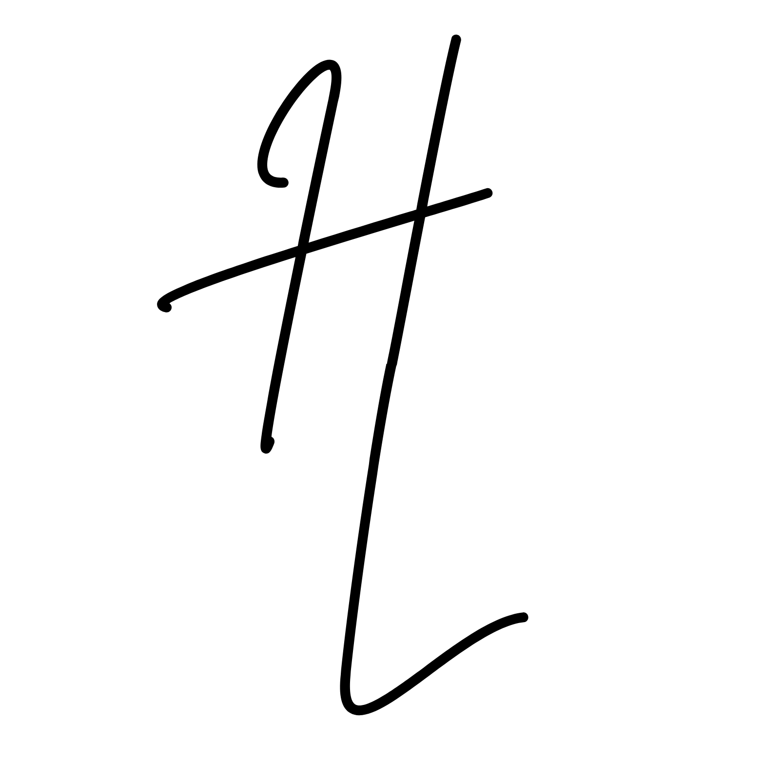
The next time you’re working on a logo, website, or sweating over your last mistake on Connections, take a moment to appreciate the power of grids. They’re the key that turns our ideas into visual masterpieces, making sure everything falls into place with precision and purpose.
Embrace the grids and watch as your designs come alive in ways you never expected. Believe me, once you unlock the magic of grids, there’s no turning back.
Works Cited
Caldwell, Cath. Graphic Design for Everyone. London ; New York, Dorling Kindersley Limited, 2019.
 Hana Lataille
Leave a comment